


DC Comics.
DC Entertainment.
NuDC.
The NEW 52!
How far can a thing go? At what great distance can a thing exist removed from its creator before it becomes more decay than growth? More anti-matter than matter? Grant Morrison told us that this DC universe is alive. How much can it take? How much torture can this universe take before it turns on all of us and destroys us for our part in its creation? Our part in enabling those that would pervert it, exploit it and punish it with bad fashion? Our part in refusing to sign the do not resuscitate papers?
Comics.
Comics.
Oh God comics.
DC Comics does not even exist anymore. Now the company is called DC Entertainment. DCE. And really, that's just one of many titles the executives at Time Warner to use to keep track of the many umbrellas covering its many properties.
It's a name, a symbol, an icon, an avatar on a power point presentation projected on a screen or viewed on laptops or on cell pad pod phones in a board room meeting where each chair costs enough money to pay your rent. The people in those chairs are ignoring the power point. They are thinking about what they will do after the meeting. They are already mentally in the next meeting or on the golf course, or in the spa or on vacation and the very last thing they are thinking about is comic books. Most of them did not even know Time Warner made comics until someone pointed out that their billion dollar rubber bat suit movie was based on comics. Comics published by a small part of Time Warner called DC Comics. And the funny thing about corporations is that when one umbrella has tremendous success it is not necessarily good for the other umbrellas. The other umbrellas get noticed and people ask where are their other billion dollar rubber suit movies? People get fired. People get promoted. People change titles. The board room chairs spin round and round.
The next thing you know DC Comics is DC Entertainment and maybe publishing comic books is not the point any more. Publishing is so 20th century anyway. No. The real money is in exploiting these things they forgot they owned in other arenas. Billion dollar rubber suit movies don't just make themselves.
Yes, DC Comics is long gone but for the sake of this article I will still refer to it as DC Comics because saying/thinking/typing "DC Entertainment" makes me want to throw up.
I love DC Comics. I love the comics, I love the characters and I love their creators. I am what you might call, a fan. I share my enjoyment of these comics and characters with my kids. These comics and characters have been a part of my life for the entirety of my life. I cannot remember a point of my life when I was not aware of Batman, Superman and Wonder Woman. I know them. I understand them. They are as matter of fact as any person or thing I've ever known.
But I have huge problems with DC Comics. I have huge problems with how the creators of these characters and their families have been treated. I have a lot of problems with how the characters have been cared for. To Time Warner, these characters are not characters at all. They are properties. Potential film, television, video games, toys, apparel etc.-- properties. Comics are just one of the many and possibly least valuable venues in which these properties can be exploited. And I get all of that. God bless capitalism get all the cash ya can get yee haw boy howdy. I get all that.
But what eats at me is that Time Warner should not really own all of these characters and be able to exploit them without consequence or retribution to their true creators. At best, Time Warner are custodians of these characters. One day Time Warner will be gone. Superman, Batman and Wonder Woman will remain. Time Warner will fail or be sold or be split the way that companies always have. The properties will be sold or traded. Someone else will be the custodians. Maybe we will all be the custodians. But for now, Time Warner are the custodians and I feel they owe it to the creators and audience that came before and to the creators and audience that are yet to come to take good care of these characters so that future generations can enjoy them and maybe, just maybe be inspired by them. And if that is to cheesy for ya then let's say they owe it to their share holders not to screw up the long term value of these properties.

Time Warner is made up of a lot of custodians with a lot of umbrellas trying to keep a lot of properties out of the rain. The lady currently holding an umbrella over Superman, Batman and Wonder Woman is Diane Nelson. It is hard to find out much about Diane Nelson on the Internets but it seems that her previous job was waving enough cash in front of J.K. Rowling to keep her from noticing that Time Warner turned her intermediate reader children's book series into horror films. I'm not sure what role she has at DC Comics other than sending out about two memos per year and enjoying a large pay check. But at Time Warner executive meetings, DC Comics is under her umbrella.
If you hop in the the wayback machine to 2009 you see Time Warner moving a lot of deck chairs on a sinking DC Comics ship. Time Warner had a billion dollar movie about a guy in a rubber bat suit. This movie was The Dark Knight. At some executive meeting someone remembered that this bat suit character was also in comics. Someone explained that Time Warner also owned those comics. As best I can figure, it became Diane Nelson's job to figure out how mine those comics for more billion dollar rubber suit movies. Apparently part of that job included saving the little hamlet in which all those properties lived. The DC Comics Universe.
Their brilliant new plan for how to save DC Comics came in two parts.
The first is to reboot/relaunch/start over the same comics that were not doing all so hot to begin with. Because, um, yeah, that had worked so well all the previous times? I have no idea. I've got nothing. I assume the real point of that was to try to get the same kind of mainstream press coverage they got in the 80s with Man of Steel or in the 90s with Death of Superman. I guess they were overdue.
The other part of the plan was to hand a new digital distributor more power and control over their product than the previous distribution model (the direct market) had ever had in the previous 30 or so years it had carried DC Comics on its back. Um... the music industry would like to wish you good luck with that.
I have a lot of horrible nauseating thoughts and ideas on why these decisions have been made but... that's another essay. I won't go down that rabbit hole right now. Just look away. I don't want to argue about it or even think about it. Smarter people than I that are closer to the action have already debated the thing to death and it does not matter.
It.
Does.
Not.
Matter.
You can't argue with a corporation. You can complain all you want but Time Warner is not in the business of giving you what you want. They are in the business of giving you what they want you to have. In some board meeting this thing will be declared a success or a failure based on how the numbers need to be crunched in order for that umbrella holder to get a bigger bonus.
It does not matter.
Let's just pretend that there is no reboot/relaunch etc. Let's just pretend our pals at good old DC Comics decided to roll out some new comics because that's what alleged comic book publishers do.
Oh say, did you hear that Grant Morrison was going to be writing a new Superman comic? Well gosh gee wilickers wow I loves me some Grant Morrison. Remember those JLA comics he wrote? Those were so much fun. Hooray!
Oh did you hear that there is going to be a new Animal Man comic? Oh man I love Animal Man! I had most of the Grant Morrison issues where he pretty much laid out the next decade of pop entertainment and then the issues by those other guys that came after, they were swell too! Oh man I want to check out that stuff for sure!
See, here's the thing. DC Comics has said that the point of the relaunch was to build two audiences. One being new readers. The other being the readers they had lost over the years. I am that second audience. It's me. Here I am. Hi! Now I can't ever be a new reader but I am half the demographic they want and I'm here to tell you that you did not have to give Superman a collar and burn his trunks to get me back. All ya really had to do was pay Grant Morrison to write a Superman comic or bring back an interesting book like Animal Man. Or, to put it another way, all you really had to do was make better comics. But I'll take the marketing. Time Warner waking up and realizing that they publish comics and that expanding the readership is a positive for the viability of their properties and therefor deciding to actually invest some money and use the power of corporate synergy to market those comics, that's a good thing. I hope. I hope retailers sell more comics. I hope new customers discover comic book shops. I hope readers find and enjoy books that meet their tastes. And if that happens over the long run I think more credit should be given to an investment in marketing than to gimmicks like re-numbering or collars on costumes.
So, here we are. We have the New DC. NuDC. The New 52. Whatever.
Now, re-adjust your way back machine to August 31, 2011. There I am. I've read all about the New 52. I'm sceptical but I'm curious. I don't live near enough to a comic book store to justify making the trip but I do live near a computer so I'm thinking about checking out the Comixology thing. I've read comics on it before. It's okay. I'd rather have paper but I have to admit the immediacy of being able to read something on impulse appeals to me. So I login only to find that the only new comics are Flashpoint and Justice League. I have no interest in either. I was hoping for Grant Morrison's Action Comics.
Fast forward one week later and Action is out. I've heard from pals that it is really good. I login to Comixolgoy but I see the price. $3.99. My ramen noodle lunch cost me seventeen cents. $3.99 is a lot of money for something you don't even own. I mean, maybe if it was a PDF? But to pay $3.99 for something that is really just on loan to you? I mean, DC and or Comixology could take it away at any time. Nah. I'll wait and hopefully get a paper copy.
We jump ahead again to the Monday of September 12. My daughter is sick. She's been fighting a cough for a few weeks so I break down and take her to the pediatrician. The office is a short drive away from the nearest comics shop so I decide to take my daughter and myself over there for a treat. She gets an Archie comic for herself and one for her sister. I want Action #1 but it is sold out. I look through a few of the other New 52 comics and most of them look like the worst of the Image comics. And I'm not talking the good Image when Warren Ellis came in and showed them how to tell a story. I'm talking the worst. Ugly covers, ugly character design, ugly colors- bad comics. I look at OMAC. It looks promising. I really like the art but I can't pull the trigger on a Dan Didio written comic. I thought his stuff was the worst of the Wednesday Comics.
The comics shop has exactly one copy of Animal Man #1 left. I wanted it from the start second only to Action so I buy it no questions asked without even looking through it.
Animal Man #1 is $2.99. It is written by Jeff Lemire. Pencils by Travel Foreman. Inks by Foreman and Dan Green. Colors by Lovern Kindzierski. Letters by Jared Fletcher. Edits by Joey Cavalieri with Kate Stewart.
Its cover looks like this.

Ok. So let's take a look at this cover. It's super nice right? I really like it. I remember looking through all the cover images as they trickled through teh comics intronets leading up to the big launch and this cover, the Swamp Thing cover and the Action cover were the only ones that stood out for me. The rest are incoherent muddy messes. I'd say Animal Man is the strongest followed by Swamp Thing. My main complaint of Action is that it looks so much like the first issues of Ultimate Spider-Man and Ultimate X-Men. Which, was probably what they were shooting for. I like the Hawkman cover too but it's negative space is a bit off. The weight is not properly balanced. But this Animal Man cover, perfect balance of the negative space. And the design is really sharp. Simple yet bold. I played around with it in photoshop and it looks good at any size. And I think that is important for a comics cover. I needs to look good from across the store. It needs to look good as a tiny little jpeg in teh intronets. And this does.
And the drawing is strong as well. I'll talk about my thoughts on Foreman's cartooning as we go through this but I'll go ahead right now and say that the guy sho can draw. So yeah. I think it's a good cover.
Now, let's talk again about DC's alleged goals with this whole re-launch. Bring in new readers and bring back old readers. Does this cover do that? Maybe? I am old reader. And specifically, I am old Animal Man reader. This cover to me looks like a good Animal Man comic. It would fit right in with the covers on the old Vertigo series. (It reminds me a lot of the Mike Grell covers for Green Arrow back in the day when Green Arrow was a "New Format" comic. For the children out there, "New Format" became Vertigo but Green Arrow did not make the move. Animal Man did..) So yeah, for me an old Animal Man reader this cover certainly worked because I did seek it out and pay cash money for it. New 52 mission accomplished sort of.
Now for new readers, eh. I don't know. It looks like the cover to a horror comic. Which is okay because it pretty much is a horror comic. There is not anything super hero looking about it at all. Animal Man is not in a heroic pose. He's looking down. He looks like something horrible has happened or is about to happen. If there is a new reader out there looking for something different, something more mature, something edgy and something a bit spooky then maybe this cover works for them.
My one nitpick about the cover would be the red. Animal Man is standing under and/or is connected to this big red lung looking thing. Are those veins or just general creeping spookiness? I get it, it works and it looks great but... I'm kind of a wimp about gore. I have to look away when my wife watches those medical shows. So, for me personally, the red made me go ewww at first. But having read the book I can say that it is not there to be sensational. It actually does relate to a story element. So, I'm totally cool with it but....

...let's take a look at it without the red. Or without any color at all. Wow. It still works doesn't it? Still just as spooky but not as gory. Just as bold. Maybe even bolder. I like it. See good design, good use of negative space, good drawing- you get all that going and color does not matter at all. But enough about the cover, let's actually look at the comic. No, wait. One more thing...

Let's take a look at the bottom of the cover. Check out all those awesome animals. That's the type of thing Mike Grell used to throw on covers all the time and I loved it. A bear that is as tall as an elephant that is as big as a whale that is hanging out with a giant squid? Don Heck yeah! But look a bit closer down there on the bottom left. Take a look at the most important element on this cover. Yes, that is a kitty cat riding on a turtle. And that is adorable.

CAN I RIDE THIZ TUDDUL?
I guess I should just go ahead and admit that the real reason it took me so long to post this review is that I have spent the past two weeks writing Animal Man fanfic where his sidekick is a turtle riding kitteh. I call them Poncho and Skeet.
Ok. So let's finally take a look at this comic. Let me go ahead and say right now that the rest of this post will contain some scans from the book. Most all of these scans are cropped so please do not get the impression that this is exactly what the book looks like. I did this for three reasons. For one, I'm only interested in showing you the things I want to talk about. Two, I don't want to totally ruin things for folks that might want to read this. And three, scanning and posting multiple full pages fills a little piratey to me. No offense to pirates but I'm more team ninja. It's a matter of hygiene really.
Open up the comic and the first thing you see is an advertisement for chewing gum. The second thing you see is a bunch of text. Not the most exciting way to start a comic book but I get what Lemire is doing here. The text is a mock interview with Animal Man/Buddy Baker which serves the purpose of getting the reader up to date on his new status quo. It's not a bad gimmick and Lemire pulls it off fine but I don't think that it is necessary. I'd rather jump right into the story.
Which is what happens when we turn the page.

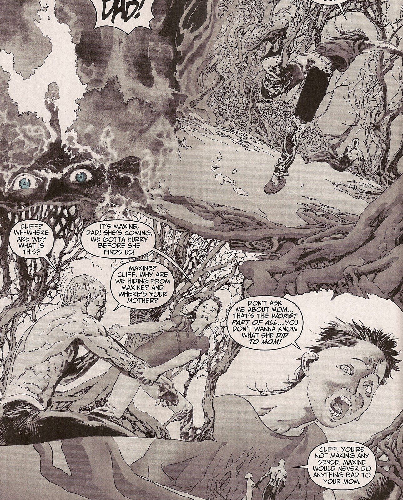
Wow. So Travel Foreman has decided to slap us in our brains with a two page semi-splashy layout breaking and or bending all kinds of rules of logic. I don't like limiting an art form down to right ways or wrong ways but there are certainly ways that I prefer over others. Foreman clearly disagrees with most of my storytelling tastes. I'm super interested in the choices other cartoonists make when they lay out a page and a lot of what Foreman does here and throughout the book is mind boggling to me.
First let me talk about gutters.
In my opinion comics may be the first interactive visual art/entertainment medium. The reader controls much of the story. The reader controls what happens between the panels. In traditional comics you have a uniform space between each panel. This space is the gutter. What happens in the gutter is up to the reader. The artist can manipulate this to a certain extent to try to control pacing or intensity but usually the gutters are uniform in their distance between each panels. When that distance varies or, God forbid there are not gutters, it can be disorienting for the reader. Or at least this reader. When I see panels on top of each other without any gutter the feeling I get is that the images are taking place at the exact same time. It's like looking at a cracked mirror. When choosing a gutter strategy, Foreman's answer seems to be all of the above.
The main image in this splash is a big wide establishing image of the Baker family's kitchen. But it's not a full bleed or a traditional panel. It's kind of both. It bleeds on the right but on the bottom it has a border with an insane angle. Perspectives change from image to image as if the reader is a ghost floating about the room. Some panels are floating on top of the main image sans gutters. One image is a head floating in the void with no borders. And in another, that crazy angle from the main image cuts off Buddy's head leaving us with only a close up of his elbow while preserving the drawing of the kitchen faucet in the main image.

Of course, that is one bitchin' kitchen faucet he drew and/or traced and/or photoshoped in there isn't it?
There is nothing wrong with any of these choices on their own but in really good comics all of these kinds of choices mean something. A head floating in space without a border can mean a disconnect or a loneliness. A head chopped off could foreshadow some impending doom. All of which are good and interesting choices in most comics but here in these two pages there is so much layout insanity that it is very disorienting.
And maybe that is the point. As we will see as we get through this comic it is a horror comic and maybe disorienting and confusing is what Foreman is going for. If so, then well played.
Now, about the drawing. I really like Travel Foreman's drawing. He is really great at expression and he uses some wacky Gene Golan angles to give even the talking scenes some energy. His style reminds me of a lot of commercial ad art you would see in the 70s. Super clean and very little shading. The real work is in the pose, the movement and composition. I think that if you had only the outlines of his characters you would still get what their doing,saying, feeling in each panel. Foreman apparently comes from a place where people are about nine heads tall instead of seven and their torsos are four or five heads long. Okay. I dig it. I really do not care if a cartoonist ignores anatomy. I prefer it really. All I ask is that the cartoonist is consistent and Foreman is. His character design is strong and he maintains a consistent cartoon reality from panel one to the last page of the comic. Simply put, he's real good at drawing.
And let's take one second to talk about the coloring. I'm going to step a way from the keyboard and stand up and clap for a second.
Okay, I'm back. This my friends is some excellent coloring. I love the pallet choices. The pallets are consistent throughout the book. The colors are mostly flat with no gimmicks. I love these colors.

Ok. Here is a more traditional page layout. And look! Gutters! Oh I loves me some gutters. But WTF is that big white space on the bottom left? Is that supposed to represent a big pause between panel three and panel four? Is that a drawing of the invisible ghost that was floating around in the first two pages? Nothing wrong with empty space or empty panels but I need it to mean something. Here it just looks like an editing error.

The next thing we see is an advertisement for the Onion TV show then we have another splashy kind of two page set where Foreman says 'Making sense is way 20th century bro, I'm taking this bitch off the rails yo'. This page is just insane. I've not slept for days over this one. At one point our invisible ghost reader is standing on the floor, at another point he's way up in the attic looking down and then, right there in the middle, Buddy's son has been sucked into the kitchen counter top! Oh my God this is a horror comic! This house eats children! Get your family out of that house now Buddy!

But everything is okay because this page also gives us this, my favorite drawing in the comic. That's a great face. Horror comics are fine but if Foreman wants my money he should make a comic where super hero wives hang out in kitchens and make sassy faces. I'd buy that.
Next is an ad for a Green Lantern team comic where they fight some sort of vampire Harley Quinn that never learned to wipe her mouth off after feeding.

At this point in the comic we are up to speed on the status quo and we have our cast in place so it is time to remind the reader that this is a NEW 52 DCU comic book where people fly around in spandex and punch bad guys. I like the idea of this drawing a lot more than the execution. The idea is a cliche' but it is a good one. The hero is flying up ready for whatever is out there. His arms are breaking out of the panel because the is real yo. He is flying into the reader's real world. But... man that costume. Well, it's not for me. It reminds me a lot of this...

...costume John Byrne used to ruin that Star Brand comic when he destroyed the New Universe. (Thanks a lot John Byrne. You raped my summer of 1987. Jerk.) Thankfully, Buddy barely wears the costume at all.
Then we get a Justice League add with that awful Jim Lee cover. Ugh.

This may be the most normal page in the comic. Or it's what you would expect in a DC comic. Nice long establishing panel that illustrates the insanity of super heroics. Neat angles. But again, gutters. The gutters have varying distances and between panel two and panel three there is no gutter. Do panel two and three happen at the same time? No, Buddy is landing in two and standing in three. Time is all messed up in this comic. Has Buddy been Inceptioned? It all feels like a dream sequence. (Foreshadowing alert!)
Then we get an ad for a Wonder Woman comic. Wonder Woman is bloody and angry. She has been sent from Paradise Island to mankind to teach about swords and kicking ass.

Then we finally get to the action. Did I mention that this is a horror comic? In the middle of our super hero punch up scene we get to see Buddy tap into the methopoanimaldnalogical field or whatever he calls that magic place he tunes into in order to steal the magical super powers of animals. Yes. All animals have super powers. Duh. And doing this is scary as hell! Magic animals are crazy scary yo. And check out all those yellow lines. Kinda like panels. Here, Foreman is going with that broken mirror panel layout idea in the totally correct way. Here multiple things are happening all at once in every direction in a way that only comics can pull off. I'm stepping away from the keyboard again. I'm clapping.
The action scene is broken up by an ad for what appears to be a comic about bATMan. I don't know what bATMan is about but he looks a lot like Batman. I hope it's a comic where ATM machines rise up to enslave us all but only bATMan can save us. Then there is a New 52 check list. Gotta catch 'em all.
In the post action pages we get a page where Buddy's eyes are bleeding. Because this is a horror comic and that's what eyes do. Then we get an Aquaman ad that looks surprisingly like Aquaman.
Here we have part of a page from the dream sequence scene of the book. Lemire is sticking to the standard horror tropes here and introducing us to the future unspeakable doom through the tried and true dream scene. Luckily for us, Foreman draws the crap out of this sort of thing. Here the panels are alive and don't need no stinking gutters. Everything is askew. Tilted angels. Great Gene Colan shadows. It's the late 90s and I'm reading my favourite Vertigo comics again. Good times.
The dream sequence, which is the most incredibly drawn and interesting part of the book is broken up by an ad for Action Comics #1.

Then Buddy wakes up from the nightmare only to find out that the walls in his bedroom have been replaced by crazy dry brush inks. Dig that jacked up panel border in panel one. In panel two and three the separating line (no gutter) ends near the top allowing that ink brush non-wall to bleed into both panels. In panel two the ink is creeping in on him. In panel three he is running into the ink. And what is up with that pyramid shape the bed and the staircase form? Is there an earthquake going on? And if so shouldn't Buddy fall off that bed in panel two? The laws of gravity are null and void. He has been Inceptioned!
I kid but this all totally works. Buddy wakes from one kind of horror only to start running into another kind of horror. On this page, you just know that when you turn the page you are going to see something horrible.
Which, turns out to be an ad for Swamp Thing. Dammit Swamp Thing. I like you but are totally ruining my willing suspension of disbelief bro.
We look to the right of Swamp Thing and see the real last page of the story.

Which is not actually Buddy staring at a black box in his back yard. I covered up the image with the black box so as not to ruin this comic's main hook. (However, this did give me a great idea for a story where the obelisk from 2001 shows up in Buddy's backyard. My pitch for that story should be at DC comics in three to five business days.) I don't want to ruin this comic's horror gimmick but it is pretty neat and a little funny. But enough about that. The main reason I posted this image is just to point out how much they ruined this beat of the comic. It should be a full page bleed but we have white on the right and left and we have the credits at the bottom. You gotta put the credits somewhere but this totally ruins the punch of this page because when you first look at it your eyes are automatically drawn to that large Animal Man logo. You don't need that. You already know you are reading an Animal Man comic. What you need is to figure out why everyone was so spooked on the previous pages and all that text kind of ruins the moment. Dang yo.
The book ends with three pages of in house ads disguised as editorial/interview stuff. There is an add for a comics shop and the back cover has video game ad so that brings the paid ad total of this comic to a whopping four advertisements. Time Warner sales department, the local high school year book staff is mocking you right now.
I enjoyed this comic. The story is slight. As expected. It is a first issue and unfortunately, comics are in a state where no one seems to expect complete stories. People seem to be impressed if anything happens at all. For a first issue, first episode, first chapter kind of thing Jeff Lemire does fine. Nothing original or unexpected but I'm not sure the audience wants original or unexpected. This comic basically has four scenes. Scene one sets up the status quo and introduces the players. Scene two let's the protagonist show off what makes him special in a little fight. Scene three is the obligatory foreshadowing through nightmare scene. Scene four is the revelation of the face of the impending doom and the cliffhanger to the next installment. I think that is what the audience expects and is most comfortable with.
The structure does not really matter. What matters is the execution and Lemire does a good job. He seems to understand these characters and be able to quickly illustrate what motivates them. The dialog is good. It is simple and human and is about the right tone you want for a comic that is going to hit the reader with some over the top horror imagery later. You set up a common reality and then tear it apart. Lemire and Foreman both do a good job with that so congratulations to whoever paired them up and put them on this book.
I can't speak for the new reader but as a guy who has not had a pull list for over four years but once spent a lot of afternoons looking through back issue boxes filling in the holes in his Animal Man collection I'll say that yes, that certainly did feel like an issue of Animal Man. I liked it. I'm curious to see what they do going forward. I like these characters and the story this comic hints at seems interesting. I don't know that I'll pay $2.99 for future issues but you'll probably see me looking through long boxes in some store or at some comic convention hoping to find them for a dollar. Hell, if the prices come down I might even read them on Comixology. And at this point that's about as nice a thing as I can say about a mainstream comic book.
Your best pal ever,
Shannon Smith
p.s. Say you want a leader but you can't seem to make up your mind. I think you'd better close it and let me guide you to my twitter feed.
p.p.s. Let's pretend we went to high school together on facebook.
p.p.p.s. Google + is another place you can read the same thing I posted here.
p.p.p.p.s. I'll tumblr for ya.
4 comments:
You know, I have mixed feelings about some of the Occupy Wall Street rhetoric. On the one hand, it's damned refreshing to hear so many people openly criticizing the pitfalls of capitalism and suggesting everyone take their money out of Bank of America.
But my initial reaction is: "You still had an account with Bank of America?!?! You're only NOW seeing problems with capitalism?!?!" Essentially, I'm wondering why it's taking everyone so long to develop an appropriate level of cynacism.
And so it is with DC Comics. On the one hand, I get it - I dug the Grant Morrison Animal Man comics back in the day. I can understand a fan's frustration over having the rug pulled out from under him like this.
But Jeezis, how many of these goddamn screw jobs are DC fans going to endure before they grow appropriately cynical about the whole corporate enterprise? And by "appropriately cynical" I mean the amount of cynacism necessary to avoid telemarketing scams and emails from Nigerian royalty. How many Earth2/Crisis/Death of Superman insults will the average DC fan put up with before they figure out that DC is a megacorporate behemoth that hates comic shop patrons? How much Secret Wars/Spiderman clone/Check-out-Cap's-new-headgear bullshit will a Marvel fan eat before he finally says, "Hey, I think this might be wasting my time?"
In short, I understand the irritation - and I applaud the collective hostility toward DC - but there seems to be some implication that the Big Two were once companies run by fans/for fans and have only recently revealed their ugly corporatism. Christ, people, what did you think those Hostess Twinkie ads were about? Elseworlds stories?
You'll forgive me if this seems snotty. But its'a little like having your friend say, "I think my girlfriend's been cheating on me," after you've been watching said girlfriend star in gangbang porn for twenty years.
1) The Hostess ads are in continuity cannon.
2) I think that one thing that gets forgotten is that these things are product. We'd love to think that they are art and from time to time they are but they are always, always product and the reader is just a customer. So, the reader (at least the paying non-pirate reader) certainly has a right to be heard when they don't like things. I wish people would just not buy bad product or product from bad companies. That would be swell. But, for those that really, really want that product, sure, go ahead and demand that the product be better. But I'd never expect Time Warner to care. Time Warner is not in the comics selling business. They are in the movie, TV show, video game, toy, lunchbox, backpack, tennis shoes selling business.
3) How many screw jobs? That's a good question. It seems to be speeding up. It used to be about one every 25 years. Not it's up to one per summer.
First of all, Hostess ads were too well-written and illustrated to be considered part of the regular DC/Marvel continuity.
Second, the business that DC is in is the Justice League business. Like Marvel, they don't operate like a normal publisher and they cater to an audience that doesn't want them to. DC fans don't want new ideas from innovative creators, they want more Batman. Lots and lots more Batman. There's really nothing else like it. I mean, TV viewers don't expect ABC to keep recasting Three's Company for 6 or 7 decades. Sure, book publishers handle series with recurring characters, but their stock in trade is original material by noteworthy authors in which characters who die more often stay dead.
Comic books follow the formula of newspaper adventure strips, which followed the formula of radio dramas...meaning that what Marvel and DC comics most closely resemble are soap operas. And we all know how completely, incurably insane soap opera fans are. "They killed Brock Mansfield! How could they DO this to me?!?!"
"Oh wait, it was just a dream Mrs. Collingsburg was having...for eight weeks."
The best you can ever hope for with the Big Two is a story arc of maybe 5 or 6 issues before the creative team gets burned out or sells a project to Image. And what you get in that short story arc is the PROMISE that a bold, new transformation is taking place...before everything goes right back the way it was.
You know, just like in real life.
I hear they finally canceled As The World Turns.
Post a Comment